Friday 21 June 2019

Two Types of cover

A common theme in entertainment magazines are a clear ,masthead with the same font each week sometimes changing colour but never changing where it sits as well as this, there is strong celebrity culture in these magazines. They use photos of celebrities who are starring in popular shows and films in order to draw attention from people who enjoy that particular pop culture as well as draw in anyone who is a fan of the actors themselves on top of their traditional readers.


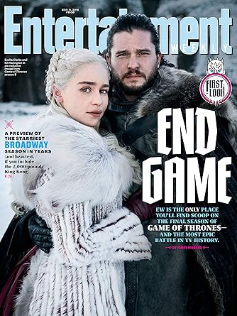
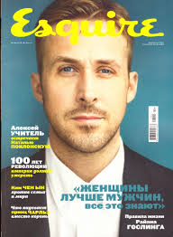
There are two different types of front cover which I am looking at to have as the same style for my front cover; firstly images used showing celebrities in character and costume is one of the styles of front covers I really like because it shows clearly the actor and clearly the reason why they are in the magazine. And secondly the type of front cover which I really like is the men in suits style, for instance still using celebrity idols which are doing something newsworthy however they are seen in suits rather than in character or in the style which there character is in. Either of these styles I would like to do however it is more feasible to get someone in a suit than it would be to sort out a set and costume as well as an actor to frame, rather than just getting someone in a suit to look sharp in front of a camera.


Image result for entertainment magazinesImage result for entertainment magazines


Stories on the cover/ in the contents page:

Podcasts:
These are a rising fashion with many people branching into podcasts in order to breach a larger audience as well as explore their own views with guest, and therefore allow a much more confidential and personal way for them to articulate themselves and what they love.
One podcast that I watch is the Misfits podcast which contains 6 guys from Australia, New Zealand and America and they create content on how their lives have changed and the involvement of life experience which have shaped who they are, they are so relatable in what they talk about, joke about, and do that it breaches the audience of the brief perfectly.

Films:
New films are coming out every year at a faster pace, as technology increases and more money is invested into film companies films come out faster, in order to be noticed in such an oversaturated market, the quality of films often comes up because it takes more than just to be cool looking in order to make a successful films. Therefore I believe I the contents page and on the front page having a link to the different new films coming out and which ones are worth the watch will sit well in a world where currently cinema and film is a growing culture amongst younger audiences.
Example of a new film which will be quite big and hopefully of high production value is Once upon a time in Hollywood.

TV shows:
New TV shows are coming out all the time some good and some bad, there is a tv series for everyone and with so many to choose from people are able to choose the exact type they want to watch, as well with all of the new shows which come out there needs to be someone to inform and allow people to know whether they are even worth 20 minutes into the first episode of the pilot or if they should just be skipped altogether therefore stories like this I believe could work.

Music:
Up and coming music artists, talk about types of music that are going out and types of music which are coming in. This could also link into artists who are making weird and obscure music which is becoming more popular for instance; Billie Eilish or Lil NasX. Therefore with using trendy music as well as trendy artist the magazine with stories about these types of music and artists will be hitting the exact 16-24 age range in the brief therefore hitting the perfect demographic and not just being there because its popular.


Friday 8 March 2019

The Bake off and Britain cover

Question 1:
In the bake off cover there is no unpredictability in the masthead with it being the traditional "The Big Issue' logo however with the image on the front that is unpredictable for instance with a new cover every week with the big issue, having one on bakeoff isn't predictable so although it is displaying a normal image it is random and unpredictable with a different image each week and not only a different image but a different style of image on each and every cover. There is an element of this cover being hybrid with fonts of all different types being displayed as opposed to just one key font, there is the main sans serif font saying 'The Great British Bake Off' yet an odd cartoon cursive like font just below it showing some hybrid and unpredictability with the fonts that the magazine uses.
The Britain cover is completely different, with a different font, use of image, however still retains the classic 'The Big Issue' masthead at the top although with some slight colour changes it still shows their Brande identity. Yet a lot of the cover is unpredictable, for instance the image shows no people in it but acknowledges all of England, it displays England as a leaf due the the topic of 'Earth Day' it is a leaf because world day is about preserving the Earth and leaves link to nature and therefore what Earth Day is about saving. The font is unpredictable as once again the cover has no indication why is uses a slanted italic font however unlike the bake off cover, the font is continuous through all the text talking about the stories inside as well as the meaning to the cover.

Question 2:
There are quite a few uses of intertextuality in the Bake off cover, one of the most obvious pieces is the continuous use of the word 'Berry' which I believe is an obvious link to the old version of Bake off which had Mary Berry on it, it is then linking her famous name to this new version of the show with new people on it, also there is intertextuality with the text box coming from noel fielding mouth stating 'I am the mighty bouche' which is a play on words which links a show which he was in in the past as bell as bouche being a type of baking item therefore it has multiple meaning and can tell people a hint as to where they might know Noel Fielding from. A third piece of intertextuality is the 'make bake of great again' hat which is very obvious intertextuality of the quote 'make America great again' which has been displayed in many presidential campaigns and is meant to infer that this new version of bake off is going to make bake off great again compared to the old version of the show.

There isn't much intertextuality shown in the Britain cover other than perhaps the link to David Attenborough who is in a story inside, it is well known that David Attenborough is devout towards nature and is a very positive towards preservation however other than this there is very little intertextuality in this.

Tuesday 26 February 2019


Image result for sexist 60's ads


I believe adverts have a completely different view of gender nowadays than they did back in the 60/70's. In adverts in the 60's there used to be incredibly sexist stereotypes and views which I believe wouldn't be accepted nowadays, one such example is the old smoking ad I have put in the top left of this page; this advert is portraying a completely sexist view of women which sees them as being under men not only in worth but in other senses as well, for instance the fact that the women in positioned on her knees below the man lounging on the bed in in order to show he is in control of her and is more powerful, I'm inferring this as he is in a more powerful position in the scene as well as his position intended in the poster. Another example of stereotypes shown in this image is the way that the man is in his work clothes of a white shirt and tie therefore compared to the women who is wearing just her dressing gown, that the man is working and providing were as the woman is just supposed to support the man and clean as well as cook. The fact that she has made him breakfast is showing also her role of carer and housewife in this image, the fact that she has also given it to him in bed intends to show his dominance over her. All of these points of sexism in this adverts went well with societies norms and stereotypes back in the 60's and back then were considered to be completely normal.

Nowadays this type of advert would not be accepted and by 'this type of advert' I mean adverts which only display women in the sense of a housewife only there to aid the man, now in adverts you're more likely to see women presented as their own independent people free of a lot of the stereotypes which we used to see in the 60's, infact due to the multiple women's rights movements we can now see adverts purposefully intending to support women having a right to do what they want.

However an effect of the lack of the stereotype linking women to being mature mothers and housewives. In place of this sexism we can now see adverts which over-sexualise women massively which now as opposed to showing women as housewives just show them as an item which a man can have usually with the help of a certain products therefore although the view of gender has changed on women there are still examples of sexism just different types. An example of women being sexualised to make men buy products is the top right corner.


A massively overlooked change, or lack there of is the gender role of men which is displayed in advertising. For nearly as long as advertising has been a thing all the way back to print advertising in newspapers there has been a long standing theme which intends to display products in a way which is seen as masculine as the companies believe that all men strive to be seen as extremely masculine and manly, this stereotype has plagued the media and I brought it up to write than it has never really changed throughout the years and that in all men's advertising it always focusses making sure the men thinks the products boosts their masculinity. However just in recent years since around 2012 there has been a lot more adverts intended for men in order to encourage men that there is nothing wrong with stopping the social stereotypes and having a feminine side to their life. and as well that it is not wrong for them to cry as it is becoming a big push for men to see their emotions and accept them and be there for other men. this type of message in advertising has not been seen before and is incredibly new. Yet there is a long way more this advertisement could go.

Friday 25 January 2019

Unfinished Sympathy

What representations of the artist are constructed in the music video?

From the start the scene is set with a quick juxtapositions; the video starts with the relaxing view and sounds of Chinese stress balls, then quickly transitions to a Pitbull terrier, not only a violent breed but owned by a gang, this juxtapositions helps to show us how dangerous this area is going from relaxing to dangerous quickly. This is needed in order to set the scene of a dangerous city in which this women is in. Yet when we see the artist for the first time in. the establishing shot of her, she doesn't care about what is happening around her she is just focusing forward; therefore to me the fact that she is able to ignore this gang which is abnormal to me it shows a representation of the artist as being used to this kind of behaviour suggesting her locality to LA and particularly the street she is on.

The music video is filmed in one long continuous shot following the singer/actor in the video as she walks around the streets of LA, as with the example of the gang lots of other things happen around her which she is oblivious to. The reason why she is oblivious to it is because she is obviously heartbroken; the reason why I think this is firstly due to the music, its tone is sad and depressing as well as the lyrics displaying heartbreak and the ending of  a relationship which this woman really cared about. secondly she is dressed in full black which is typically a colour worn when sad and depressed, this is the exact impression which it gave me that she is so lonely she wears black just attempting to display her mood through clothing.

Not only does the artist wish to represent this in the video they also want to bring a voice and start a conversation in the real world over issues happening in the background of the long continuous shot of this woman walking about; what I'm talking about is a few different stories being told in the background; one story is of a native American man on the street having to dress as his ancestors to raise money and awareness because as he stands there evil people are attempting to take his ancestral
homeland for corporate uses, the video is attempting to voice this, as well there is a man with no legs riding around on a skateboard it is assumed he is a veteran who does not even have support of the evil corrupt government and health system to even afford a wheelchair.

Wednesday 9 January 2019

Roland Barthes

Roland Barthes is a French Scholar; he was well known for his work on semiotics Revolutionising the world of media by establishing the  'New Criticism' as revolutionary, The new criticism had the idea that all texts were 'closed' meant to mean that no outside sources should be needed in order to understand the meaning of text, that all you had to do to understand is analyse that text.

I believe that the new criticism to be  great way in which texts can be broken down and understood; the use then of the codes is an essential part of taking apart the small connotations and meanings which are hidden behind texts, not only texts but also now meanings behind movies, by studying the signs in them, the use of connotations and denotations is an important part of what Roland Barthes using the new criticism does. The use of codes under the new criticism are what writers and other creators of media use  in order to portray to the audience the message which they want to be in the text hidden behind different connotations, denotations and codes in words. The reason for why I see the new criticism as the best way in order to understand meanings behind texts is because you are directly taking word, sentences furthermore whole pages to decipher hidden meanings therefore not taking anything out of context, if it happens that something is written inside the book with connotations, then it is meant to show the writers meaning that it is indeed intended to be there. Were as analysing outside sources from the book will not portray the true meaning which the story entails.


Friday 14 December 2018

Fat Boy Slim- Representations of the artist. Yo Mama

FatBoy Slim is a Dj with a very specific style of music video; His style is complete randomness, every single music video for each of Fatboy Slims songs is diferent with no similarities other than being completely different, in different locations, with different actors with lots of random scene changes and camera shots which make the videos opposites. However one similarity which is shown in each video is the fact that there is someone dancing; the reason for this is to show the dancing style which Fatboy slim is known for, that all his music is specifically for dancing and dance music therefore a small similarity between each video is the fact that his music makes you want to dance.

At the start of the music video Yo Mama there is a calm atmosphere  created through the men who we assume are hilbillys, who are painting and watching cartoons and in general just relaxing. Through mise en scene of the characters I could tell that they are hilbillys through stereotypes of that type of people; the stereotype is shown by them wearing scrappy clothes as well as the look of their teeth and how they do not take care of themselves, also the way that the house is set up in the music video implies hilbilly behaviours of not having too much money sleeping is ramshackle abodes as opposed to usual houses.

From behind the scenes footage we know that the actors playing hilbillies are in fact just that; as well the fact they are on a tropical island, these together do in fact show a representation of Fatboy Slim and this presentation being the complete randomness which he creates, his life is a party and all sorts of crazy mental things have happened around him, I believe that these crazy mental things follow in his music and furthermore the music videos, such as the hillbillies do not make sense being on this island yet it is so due to the power of his music, as if the complete crazy music brings about the chain of events which happens within the video having turned everything on its head and just completely switched everyone to being weird, or at least weird when seen by normal people.

There is a large comedic element which the director has attempted to capture in the video; this comedic element is the thrashing fits which people apart of the video have when listening to the Yo Mama, these fits a funny because they are completely random and are an attempt by the director to show a comedic representation of Fatboy Slim. The way that the actors go into thrashing fits of dancing is not only funny but intended to represent the raves which this type of music would typically be played in and the dancing which would happen in them, where it is not really dancing but as I said thrashing fits.